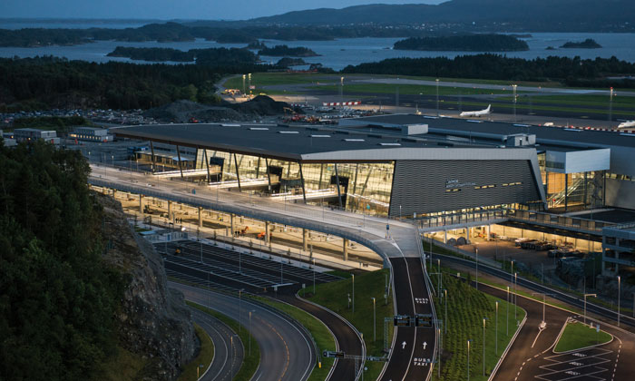
Bergen Airport: Gateway to the fjords
- Like
- Digg
- Del
- Tumblr
- VKontakte
- Buffer
- Love This
- Odnoklassniki
- Meneame
- Blogger
- Amazon
- Yahoo Mail
- Gmail
- AOL
- Newsvine
- HackerNews
- Evernote
- MySpace
- Mail.ru
- Viadeo
- Line
- Comments
- Yummly
- SMS
- Viber
- Telegram
- Subscribe
- Skype
- Facebook Messenger
- Kakao
- LiveJournal
- Yammer
- Edgar
- Fintel
- Mix
- Instapaper
- Copy Link
Posted: 4 December 2017 | Eskild Andersen - partner at Office of Architecture | No comments yet
In any airport it is important to know where you are and where you are going. The same principles apply to the task of designing an airport. Is the airport communicating a sense of place? Where is the airport headed in terms of size and forecasted passenger numbers in the years to come? These were two of the main considerations addressed by Eskild Andersen, the architect behind the newly-opened Bergen Airport, and partner at Nordic – Office of Architecture.


Originally built for a capacity of 2.8 million passengers, the new terminal at Bergen Airport increases this to 7.5 million and prepares the airport for future expansions without sacrificing the concept. Sense of place is vital here; western Norway is defined by its unique landscape, with deep fjords, high mountains and rapidly changing weather. To truly become the ‘Gateway to the Fjords’, Bergen Airport had to embody the feel of the landscape in which it is positioned and become an interesting part of the journey itself. The result was a concept named ‘Wingspan’, uniting the idea of flight and the forms of the local landscape to create an emotive building taking the shape of a pair of wings spread wide when viewed from the side. These two wings define the main spaces within the terminal: The Arrival/ Departures Hall and the pier.
Arrivals and Departures
The Terminal’s central building is comprised of the Arrival and Departure Halls. The Arrival Hall features a light-filled double height space that binds the two public areas of arrival and departure into a harmonious and almost cathedral-like space. The Arrival Hall is characterised by four dominant design elements: The delicate and ephemeral structural glass façade, the powerful forms of the steel trusses, the exquisite timber ceiling and the dramatic entrance bridges spanning overhead.
The Departure Hall is the architectural centrepiece of the terminal. The identity of the room is defined by the expansive tiled floor and the timber clad ceiling. The undulating main ceiling connects both the central building and the pier. This canopy of delicate timber slats gives a warm glow to the interior of the terminal – it starts outside the building, passes through the minimalistic glass façade and is one of the single most important elements of the design. The building’s main structure is especially visible in this space; it gives the terminal its identity and its principal direction. Together with the skylights, they lead towards the central zone and the entrance to security.
From entrance to exit, a passenger can see through the entirety of the terminal building. This transparency, supplemented with well-designed and legible signage, makes for a pleasant way-finding experience. The principles of universally accessible design are evident in the terminal’s layout, details and installations. These embody the belief in equal opportunities for flexible use, simple and intuitive orientation, intelligible information, low physical exertion and adequate sizing for access.
The pier
The pier opens up towards the fjord and the sky, facing the journey ahead. The warm timber cladding that adorns the main ceiling and the tile floor from the central building flows through from security to offer continuity. The pier – exuding a more intimate atmosphere – mirrors the design of the Departure Hall. Here we find freestanding pavilions that facilitate service and commercial uses. The two central pavilions are curvaceous in form and donned in timber cladding, with auxiliary pavilions dressed in crisp glass panels. The glazed double façade facing west addresses the apron and awaiting aircraft. This panorama is interrupted only periodically by departure gates that announce themselves in both colour and form.
Planning ahead
Designing a terminal building is a little like creating a masterplan for a city. The only thing one can be sure of is that it won’t turn out exactly as planned, and planning for the unforeseen is difficult, to say the least. To address this, modularity has been an important principle at Bergen Airport – each part of the building can be expanded as required. Need a bit more pier? Just add a nine-metre-long pier module or two. Need more space in the security area? No problem; it can easily be expanded despite being in the centre of the building mass. Need more baggage carousels? The drawings are ready. And best of all: much of the groundwork is already complete.
On the subject of baggage; the baggage handling system at Bergen Airport is one of the main reasons it can handle a dramatic increase in passengers. The state-of-the-art system is actually built to accommodate more than the 7.5 million passengers scheduled to pass through the airport every year. Using an individual carrier system allied with a dynamic bag store, the functionality and reliability of baggage processing is greatly increased. While these systems have significantly improved both the capacity and accuracy of the entire baggage-handling situation, it has also reduced the need for crew throughout this process. It is furthermore extremely spatially efficient.
The system can trace baggage with a reliability of an impressive 99.9% – a statistic not only important to the owner of the bag, but to the airport as well. A lost bag can cost the airline a significant sum just to recover, and there is of course the security aspect to consider.
Baggage arrival hall
The baggage arrival hall, comprising both domestic and international flights, is located on the ground floor and divided into two large luggage halls. Here the materials have been selected to address the reduced levels of daylight and are characterised by bright floor tiles and a ceiling of white-lacquered perforated aluminium panels. These give visual depth to the ceiling while cleverly solving the acoustic requirements. A dramatic lighting element, designed as a floating luminous band, sits over the luggage carousels and highlights their presence and function.
Materials bring everything together
Using just a few different materials has been an important design principle with each material having been chosen for a specific reason. Their characteristics and properties have also been assessed in response to a comprehensive list of client and regulatory requirements. Operational, maintenance and architectural requirements were taken into account, as were important environmental demands. Materials that contribute the lowest possible greenhouse gas emissions were preferred and aspects such as origin, life-cycle, maintenance, degradability and recyclability were constantly considered.
The result was a strict palette that helped to give the building its sense of place, while also adhering to the aforementioned considerations. Steel defines the shape of the spaces and provides support throughout the building. Glass is used in the façades to create transparency, but also as cladding to interior surfaces as it creates sharpness in the design that few other materials can provide. Timber, as we have already mentioned, provides a warmth to the ceiling, but is also used for the benches, slatted walls and the humourously shaped signs for the toilets.
The ceiling gives the space a warm Scandinavian glow, while also allowing the use of harder, more durable materials on surfaces that are more prone to wear and tear, without making the building seem cold and unwelcoming. This strategy works: Bergen Airport has become a friendly place – just ask anyone who works there.
Biography


